The collection of work featured below focuses on the development of visual identities and brand experiences for a diverse client base across hospitality, architecture, technology, beauty, fashion, and the arts. Lindsay’s deliberate contributions to each of the projects featured reflect over a decade of experience in the field of design that has been honed through her tenure at studios in Paris and New York City and leading projects independently as creative director.
Sabin, Architectural Lighting;
The Seagate, Delray Hotel and Beach Club;
Rochambeau, Back Bay Brasserie;
Simpler Syrup, Re-imagined Bar Staple;
Vent de Terre, Parisian Handbags;
Revolver New York, Creative Studio;
Fellow, Catskills Café;
Mei-Tsen Chen, Multimedia Artist;
Carmen Busquets, Fashion Entrepreneur;
Talk Shop, Hyatt Lounge and Cafe;
Chrislyn Clay, Table Arts;
Lemon Press, Mediterranean Cafe;
Yoshimi Futamura, Ceramic Sculptor;
Darya, Nantucket Salon;
Rose Archive, Repository for Roses
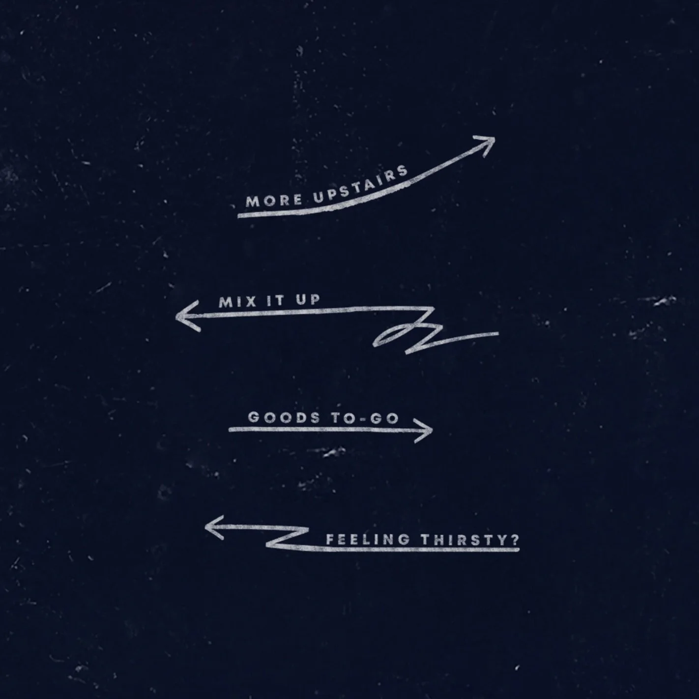
View Projects ↓
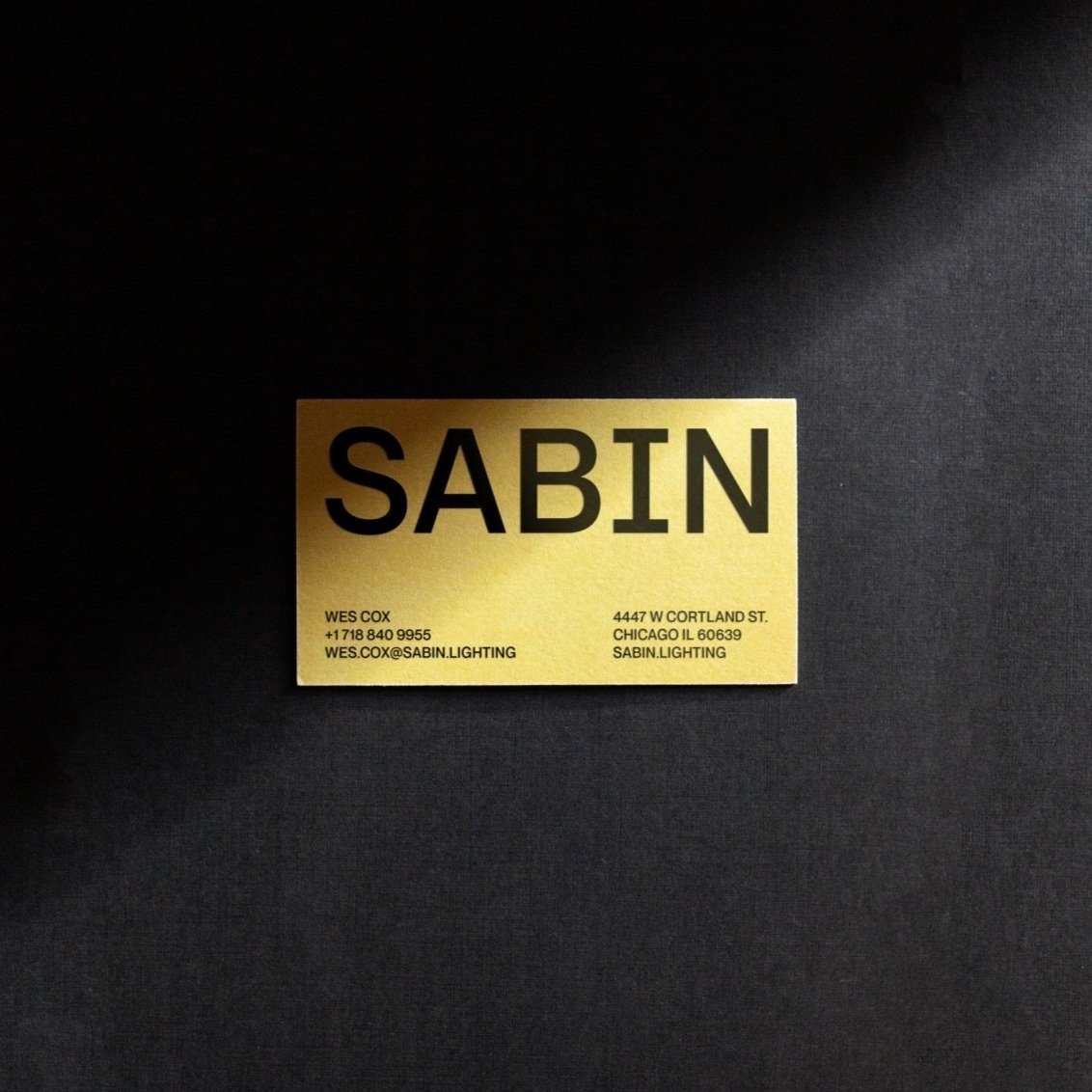
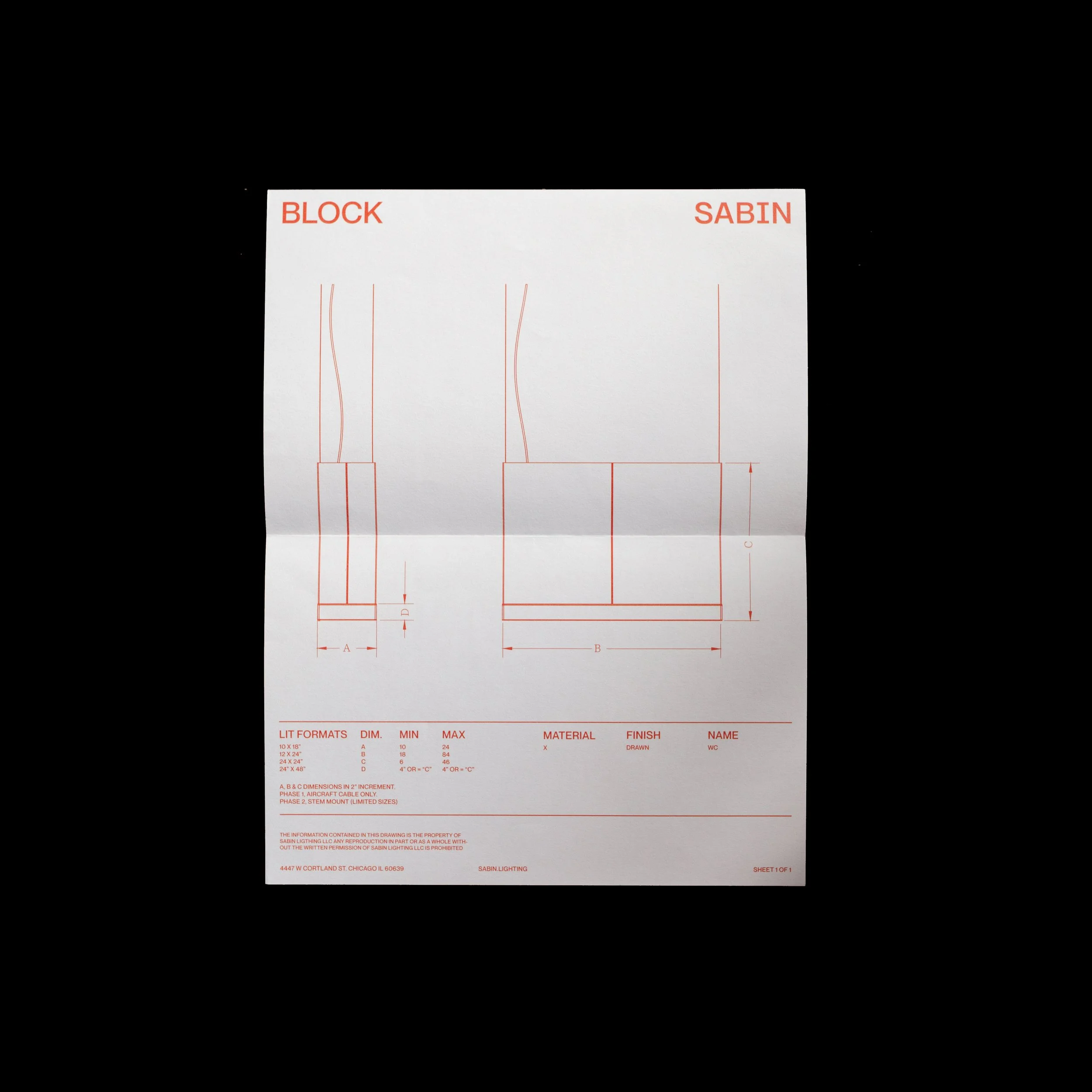
SABIN
Engineered with creativity and precision.
-
Sabin engineers superior acoustic lighting products from the ground up—using skilled craftsmanship, precise technologies, and innovative methods and materials to optimize interaction and creativity. I partnered with Sabin’s founding members to create a visual identity that reflects the company’s ethos, ensuring a brand impression that is distinctly fresh, design-competent, and ultimately, human. After establishing the identity, I orchestrated the rollout and implementation of print and digital branded materials. This included developing its foundational launch materials, guiding marketing efforts for art direction and content preparation, and designing concepts for unique tools such as the the Sabin product visualizer app and customization website.
Scope Visual Identity, Art Direction, Printed Matter, Templates, Web & App UX/UI, Packaging, Exhibit Collateral, Wayfinding, Photography; Typography Neue Montreal, Messina Modern; Sabin Partner Wes Cox; Copywriter Couper Cox; Computational Designer Tyler Van Kirk; Developer Faizal Jiwani


THE SEAGATE
Delray’s iconic hotel and beach club since 1950.
-
The Seagate is a storied destination, generous in scale yet intimate in feel. The Seagate offers a variety of exclusive experiences and members-only amenities for guests to enjoy at Delray Beach. The visual identity reflects the iconic and easygoing lifestyle that The Seagate has embodied since the 1950s—focusing on the qualities that create its signature experience. The iconic Beach Club, the light on Delray beach, the surf sounds from the hotel, and the familiarity have all given The Seagate its exclusive sense of place. The identity we created is the culmination of these characteristics, embodying a warm and personal spirit.
Scope Identity, Stationery, Retail; Typography Ringside; Studio Revolver New York; Creative Direction Alexandra Thom; Design Direction Gary Rizzolo; Interior Design Studio Robert McKinley; Photography Midjourney; Partners Long Weekend Hospitality


Rochambeau
Back Bay’s Lively Bar and Brasserie.
-
Rochambeau has kept the party going in Boston’s Back Bay neighborhood since 2019. Our team was tasked to infuse the classic French essence of the menu while capturing the energy that the establishment aimed to bring to the community. Inspired by a modern perspective on the blend of quintessentially French 40’s movie posters and visuals, the identity was grounded in a bold application of typography—brought to life with a moody and entertaining color suite anchored by a striking blue. The result blends warmly with Home Studios’ interior choices and evokes a sense of allure and entertainment.
Scope Identity, Menus, Packaging, Stationery, Signage; Typography Scout Condensed, Source Code Pro, Presicav; Studio Revolver New York; Creative Direction Alexandra Thom; Design Direction Gary Rizzolo, Erica McCarthy; Designer Adela Quesarqi; Interior Design Home Studios; Copywriter: Tom Laplaige; Photography Matt Kisiday; Partners Blue Flag Development


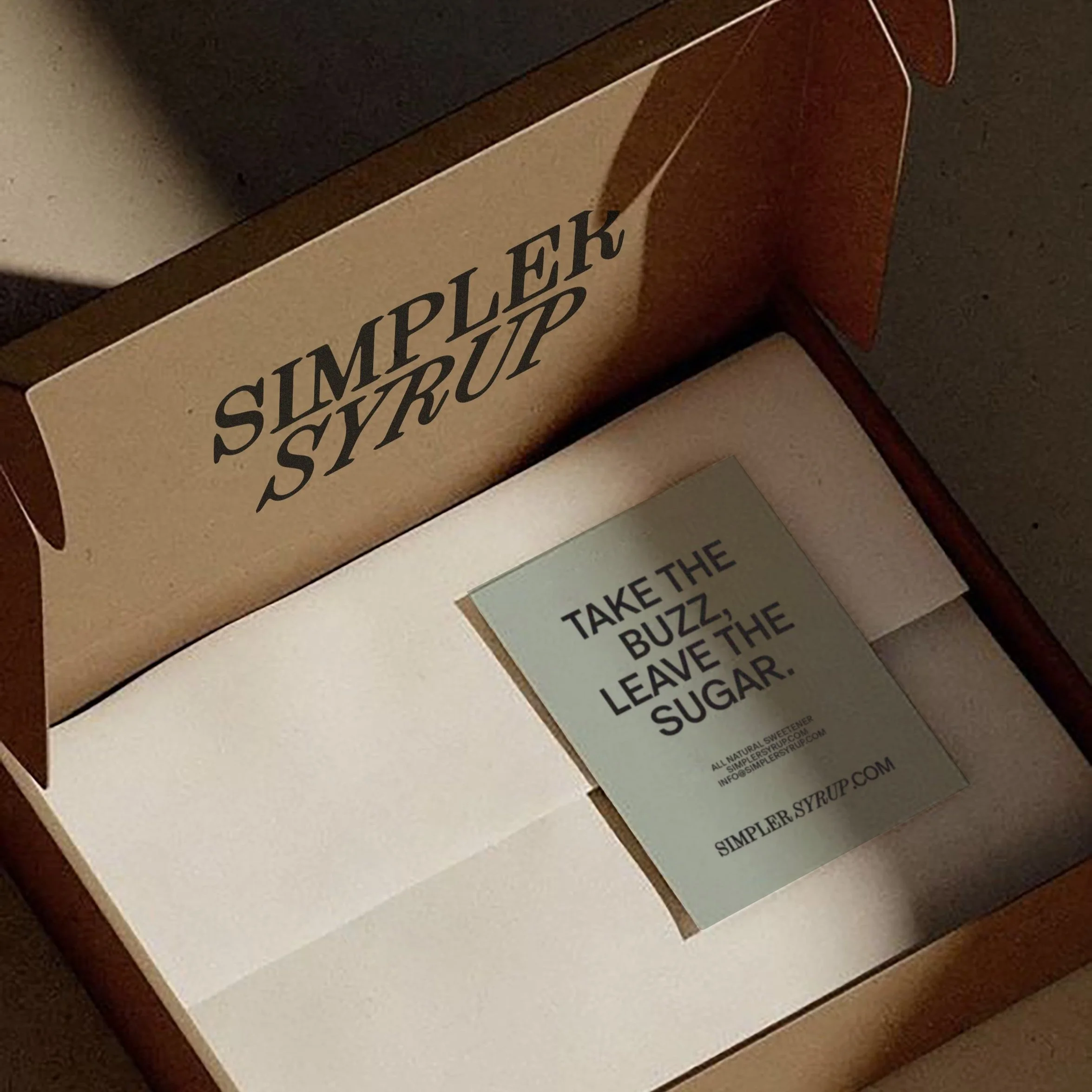
SIMPLER SYRUP
A re-imagination of the classic bar staple.
-
Simpler Syrup offers a healthy alternative to shake the cocktail world, without compromising taste. In other words—keep the enjoyment but leave out the sucrose. The visual identity is a balance of its simpler name with an air of distinction worthy of the top shelf. The organic properties of the syrup itself shine through in the minimal layouts with stamp and kraft finishes and packaging. Simple linework is a nod to the science of Simpler’s origin: at its very essence, it is a newfound chemistry that explores the future of how cocktails are enjoyed. *This is a stealth project, due in market Fall 2024.
Scope Identity, Web, Art Direction, Packaging, Printed Matter; Typography Synt, Oracle; Partners Patrick O’Shea, Couper Cox


Vent de Terre
Leather handbags made in the heart of Paris.
-
Vent de Terre has been creating leather handbags by hand since 2010. Its founder and creator, Anne Helene Garreau-Galmisch, has a vision for handbags that are both classic—beautifully hand-sewn with strong feminine silhouettes—and lively and modern. All of the bags are named for people Anne knows: friends who embody the very character of the bag. The intentionality—vision, design, colors, names—are indelibly Vent de Terre. The goal of the photo shoot was to highlight the intrinsic beauty in this level of intention: to indulge in the classic femme of each bag, to let product color lead, and to dial into all the handmade details.
Scope Art Direction, Photography, Printed Matter; Partner Anne-Helene Garreau Galmich; Model Albina Arulina


Revolver New York
A NYC-based creative studio.
-
The redefined visual identity for Revolver New York carries a timeless spirit that’s inherent in the creative studio’s commitment to process, craft and the constant evolution of ideas. The studio’s namesake served as a resource for true-to-self inspiration. The Revolver logo is characterized by a slight arch and artisan curves within its letter forms. The design palette and font system, both practical and sophisticated, allow the studio’s output to take center stage while maintaining the studio itself as a robust and reliable force for creativity.
The rebrand was initially teased with an interim website, designed to pique interest before the complete identity reveal. The website featured eight screens, each showcasing shapes and images derived from photographs of the neighborhood, presenting a novel angle on the inspiration behind the visual identity. The transitional site featured screen prints from a team workshop at Kingsland Printing.
Scope Identity, Stationery, Web, Templates; Typography Recife, Libre Franklin; Studio Revolver New York; Creative Direction Alexandra Thom; Design Direction Gary Rizzolo, Ruth Costello; Designers Sean McLaughlin, Artisha Kwak, Ali Cobb; Copywriter Paul Fischer, Jasmine Ferrell; Photography Liz Clayman


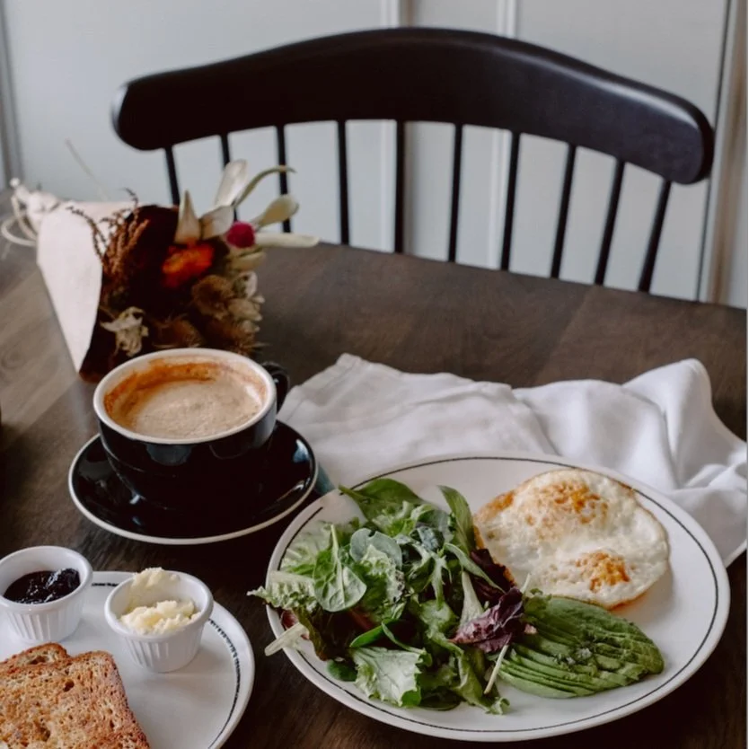
Fellow
Catskills cafe.
-
Fellow is a café and wine bar situated at the base of Hunter Mountain in upstate New York. Fellow welcomes everyone to enjoy mountain-inspired food and drinks, including locally sourced coffee, freshly baked bread and pastries, and a curated selection of natural wines—best enjoyed when shared. The visual identity draws inspiration from the camaraderie of a mountain outpost. Typography reminiscent of classic wooden trail signage serves as a visual anchor, enhancing Fellow’s charming and relaxed atmosphere, complemented by a refreshing blue tone that resonates with nature and ushers a sense of positivity and delight.
Scope Identity, Stationery, Menus, Takeaway Collateral, Web; Typography Hatch, Creantinin Pro; Studio Revolver New York; Creative Direction Alexandra Thom; Design Direction Erica McCarthy; Digital Designer Sean McLaughlin; Designer Klever Alvarado; Copywriter Paul Fischer; Interior Design Post Company; Photography Jessica Olm, Moriah Wolfe; Partner Escape Hospitality


Mei-Tsen Chen
Visual artist photographed for Trouvé.
-
Mei-Tsen Chen creates her own topography of networks in the image of the rhizomes. Using sculpture, painting, drawing, and videography as a means for mapping, she stays connected to her environment. Her work is based on an aesthetic of displacement, a setting in motion of interconnections with living beings. In her series Into The Blue, port cities transform into sprawling jellyfish. I photographed Mei-Tsen in her studio for Trouvé Magazine. The images are a continuum of her process: honest, balanced, and exploratory. Capturing Mei-Tsen with her artwork in her Paris habitat resulted in an inspiring collection of color and methodical discovery.
Scope Art Direction, Photography; Partner Mei-Tsen Chen; Publication Trouvé Magazine


Carmen Busquets
A bold-meets-femme visual identity.
-
Carmen Busquets, a Venezuelan entrepreneur renowned for her contributions to luxury and fashion, inspired the creation of a visual identity and website that reflect her dynamic, confident, and astute persona. The design employs high-contrast tones that exude warmth—paired with a fusion of fashionable, striking serifs and bold, pragmatic sans-serifs. This combination accentuates Carmen’s content and encapsulates her powerful and approachable nature. The logo and icon set, specifically crafted for Carmen, capture her elegance, which is both timeless and chic.
Scope Identity, Web;Typography Bodoni ITC, Oswald Studio Spill; Creative Direction Nicolas Mir Chaikin; Design Direction Victoria Meniakina; Designer Luca Baldini; Photographer Andres Oyuela


Talk Shop
The cafe-lounge at every Caption by Hyatt.
-
Talk Shop is a global destination with a local disposition; its both the café and lounge in Hyatt’s latest hotel release, Caption by Hyatt. Welcoming both locals and travelers, Talk Shop’s dynamic spaces cater to work, play, and rest—core functions that were paramount to incorporate in the visual identity. Talk Shop’s comfortable and capable visual language is at once universal and local. The identity is distinctly human—grounded in a hand-drawn logo and enhanced by expressive hand-drawn lines. The visual system emphasizes a diverse collection of perspectives and dialogues shaped by those who bring their own stories into the space.
Scope Identity, Menus, Signage, Retail; Typography Mont Studio Revolver New York; Creative Direction Alexandra Thom; Design Direction Gary Rizzolo; Designer Olivia Larsen; Copywriter Paul Fischer; Photography Courtesy of Talk Shop


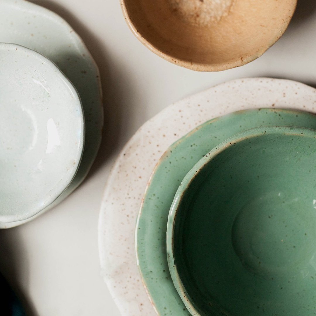
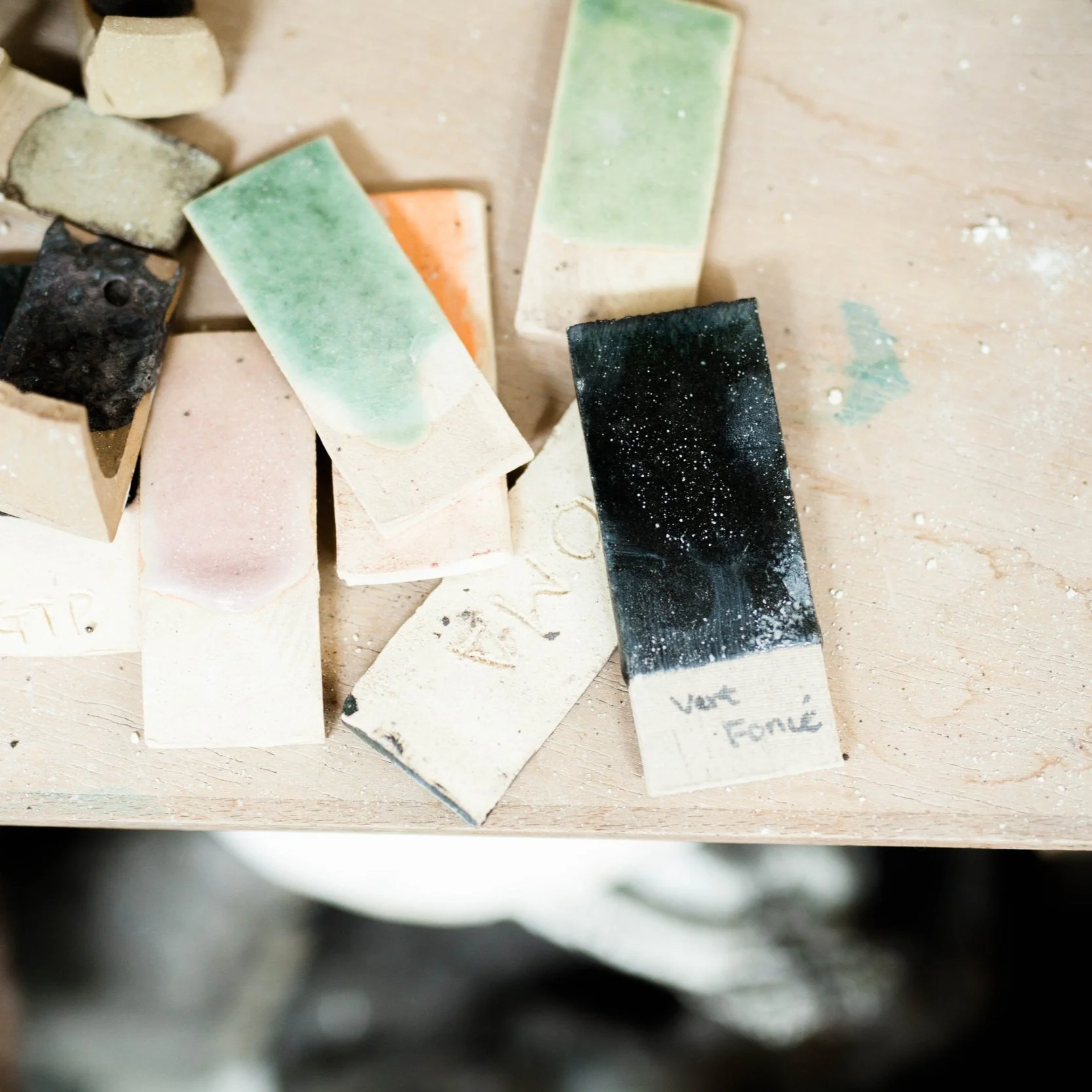
CHRISLYN CLAY
A ceramics studio that elevates the everyday.
-
Chrislyn Clay excels in creating high-quality ceramic tableware. The identity system projects the essence of its purpose—to prioritize comfort (reflecting hospitality), freshness (emphasizing food), and subtle luxury (signifying quality) that work together to elevate the significance of everyday moments. Soft, natural tones harmonize with bold, playful design elements, creating an inviting brand experience. In the words of founder Chrislyn Levinthal, “Whether you are feeding a family of five, love hosting weekly dinner parties, or savor your solo cup of coffee in solitude, I aim to enhance your daily experience of cooking, eating, and sharing meals with wares that enrich your life. It is in these seemingly ordinary yet special moments that we truly experience life, and life deserves beauty and intention.”
The visual implication of circular motion brings an important note, deeper than it’s initial feeling of levity and play to the soft and sophisticated visual groundwork. This subtle theme of circular rotating motion, evident across various Chrislyn Clay touch points, alludes to the art of shaping clay on a wheel, highlighting the handmade nature of Chrislyn Clay products and the essence of pottery itself.
Scope Visual Identity, Art Direction, Photography, Web, Printed Matter; Typography Sofia Pro; Creative Partner Chrislyn Levinthal


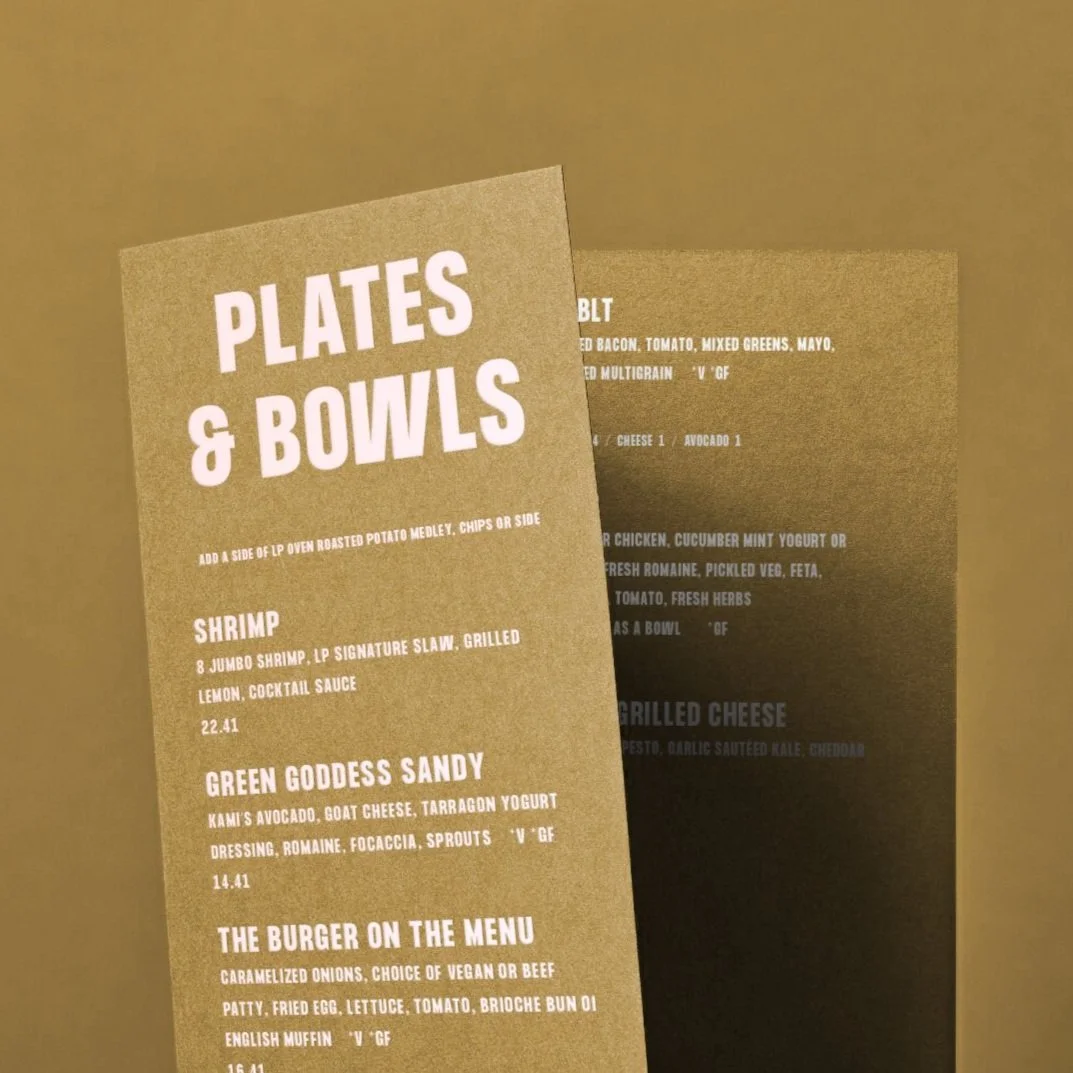
LEMON PRESS
An upbeat, all-day, mediterranean cafe.
-
Serving Nantucket from an upbeat space in downtown, Lemon Press presents memorable, vibrant, and tasteful dishes on a menu curated for a fulfilling dining experience, offering flavorful and unique options to accomplish the Lemon Press mission: to nourish the soul. The visual identity was revitalized to bring in a freshness and boldness immediately felt in the color palette and vibrant typographic system, delivering an immediate impression of what Lemon Press is all about—from fresh ingredients to the hospitable service. The result is a fun and experiential identity that attracts attention around the island with its sense of healthy refreshment.
Scope Identity, Retail, Packaging;Typography Formula Condensed Bold;Creative Partner Melissa Mazzarella; Photography Holly Rae Estrow


Yoshimi Futamura
Artist photographed for Design Anthology.
-
Yoshimi Futamura, originally from Nagoya and now residing in Paris, creates vibrant and evocative sculptural forms. In the past decade, she has developed multiple series, including Racines (roots), Rhizomes, and Vagues de terre (Earthen Waves). Employing a mixture of stoneware clays and either pre-fired granulated porcelain or porcelain slip, she molds her sculptures inspired by geology or botany. These substantial forms are occasionally adorned with feldspar, and their interiors enriched with cobalt and iron oxide glazes. I directed and photographed the vision to capture Yoshimi in her studio for Design Anthology Issue 19.
Scope Art Direction, Photography; Partner Yoshimi Futamura; Publications Design Anthology Issue 19


DaryA
Nantucket salon and spa retreat.
-
Darýa Salon and Spa is the Nantucket retreat for those who believe in the power of self-care and the importance of wellness. Located in historic downtown, the salon provides treatments and retail offerings to nourish the body and refuel the spirit. Darýa embodies the idea of holistic wellbeing, offering a refined salon and spa experience unlike anywhere else on the island. Darýa focuses on the idea of simple, empowering beauty—this ethos inspired the framework for the visual identity that centers around a confident logo and alluring color palette, applied minimally and naturally to promote a sense of calm.
Scope Identity, Art Direction; Typography Source Serif, Montserrat; Creative Partner Melissa Mazzarella; Photography Midjourney, Agata Serge


ROSE ARCHIVE
A repository for everything roses.
-
Rose Archive is a database—a digital garden serving as a resource for rose-lovers all over the world. Gardening tips for roses, lists of visit-worthy rose gardens, merchandise, and events that are rose-centric are found on Rose Archive website: the hub. The identity is grounded in the feeling of being immersed in a garden. The concept was born out of the curiosity to see a garden translated digitally, and thus Rose Archive developed into an orderly (but gushingly gorgeous) center of rosey delight. Pinks, reds, purples, saturated, unsaturated, warm, cool —the rosey spectrum is immediately palpable at all touch points. The core of the visual system operates as a filing system itself, reflecting the deliberate attention to order at the heart of Rose Archive, under all the visually striking swaths of color.
Scope Identity, Website, Packaging, Merchandise; Typography Neue Montreal


